
Designing Spaces That Sell — And Brands That Feel Real.
What We Do
We help brands translate strategy into physical experience — through 3D spatial design and visual merchandising systems that guide attention, improve flow, and increase conversion.
This service is built for businesses that want their space to work harder: not only to look good, but to move people, highlight what matters, and make buying feel effortless.
Area of Work
-
We translate your brand direction into a clear spatial concept—look & feel, mood, materials, and overall atmosphere. This ensures the space communicates the right positioning within the first few seconds.
-
We map how customers move, pause, and decide—from entry to checkout—then design the journey to feel natural.
The goal is to reduce friction and guide attention without forcing it. -
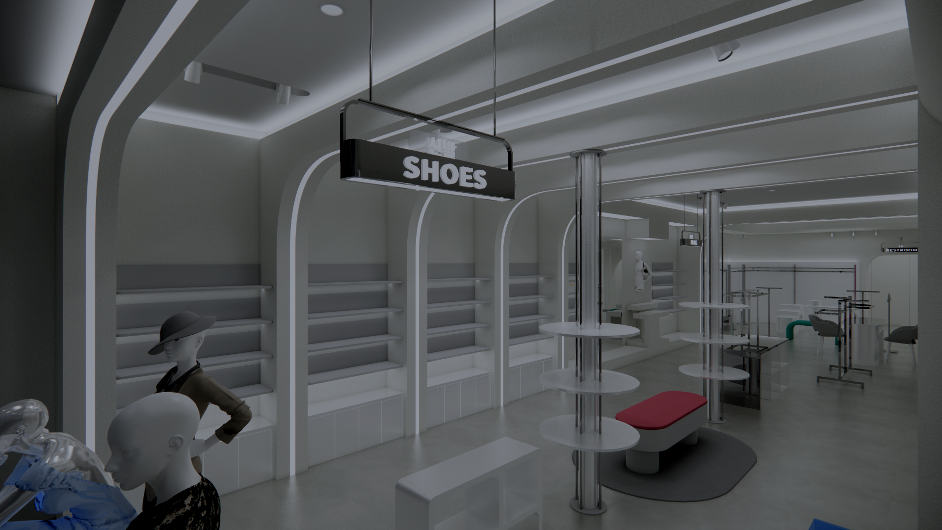
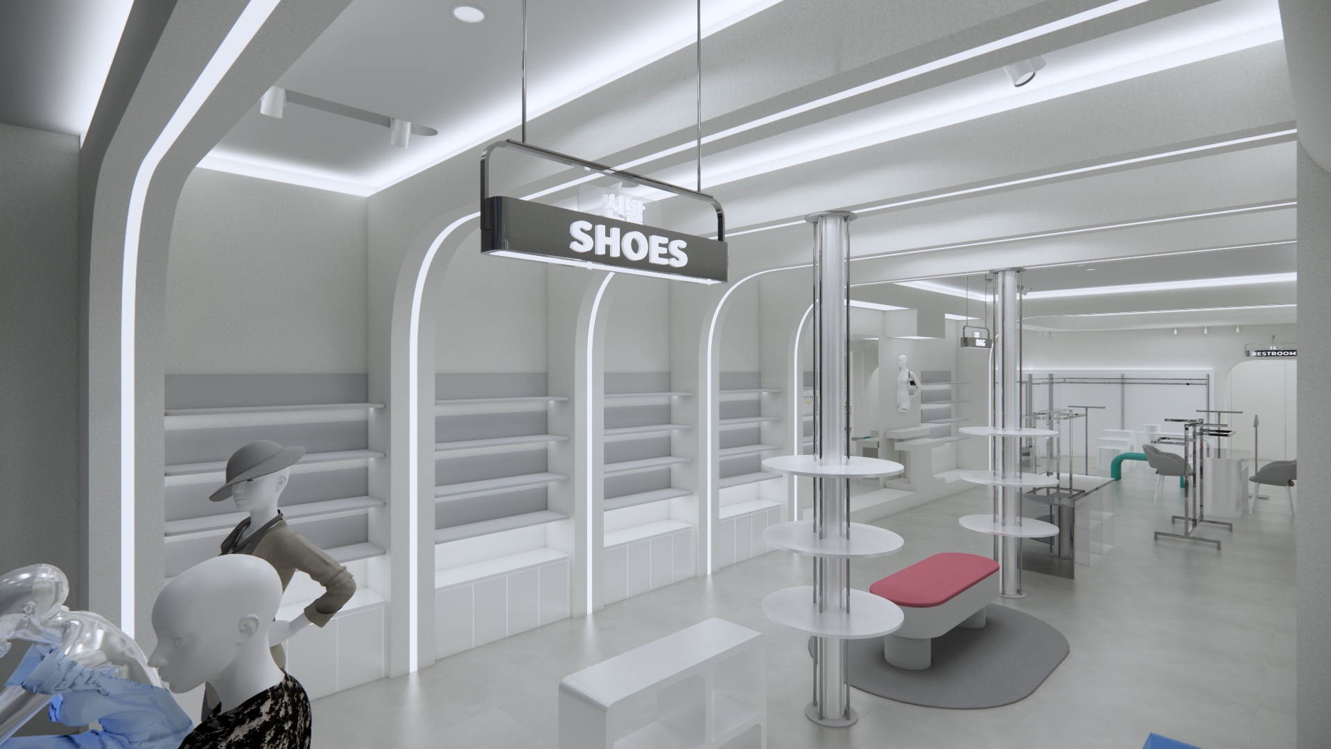
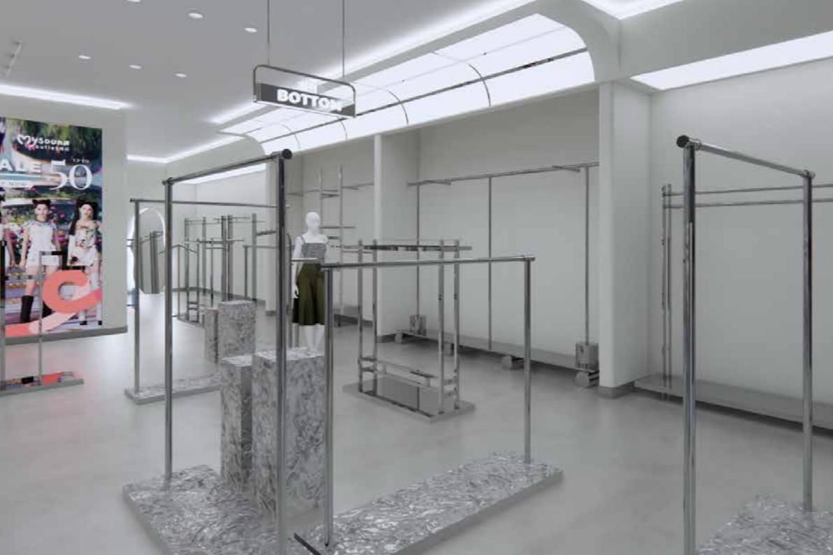
We define functional zones (welcome, main display, promo, cashier, waiting/pick-up) and connect them with a logical flow. This improves comfort, operational efficiency, and makes the space easier to understand at a glance.
-
We set a clear product hierarchy—what must be seen first, what supports it, and what drives margin.
Then we structure display logic to boost discovery, cross-sell, and conversion. -
We develop 3D visuals and fixture directions (shelves, islands, counters, wall displays) for smoother execution.
This reduces trial-and-error during production and keeps the final build aligned with the concept. -
We create repeatable placement rules: eye-level priorities, facings, grouping logic, and category flow.
This makes products easier to find, keeps shelves tidy, and improves consistency across locations. -
We guide lighting focus (what to highlight and how) and signage placement to support navigation and clarity. The space stays premium, readable, and not visually “noisy.”
-
We build VM kits for launches and seasonal moments so your team can refresh displays quickly.
Execution stays consistent, on-brand, and measurable across different periods. -
We deliver VM playbooks, SOPs, and checklists so standards are easy to maintain day-to-day.
This helps scale the same experience across branches and keeps quality controlled over time.
How We Design Spaces
Exhibition Booth
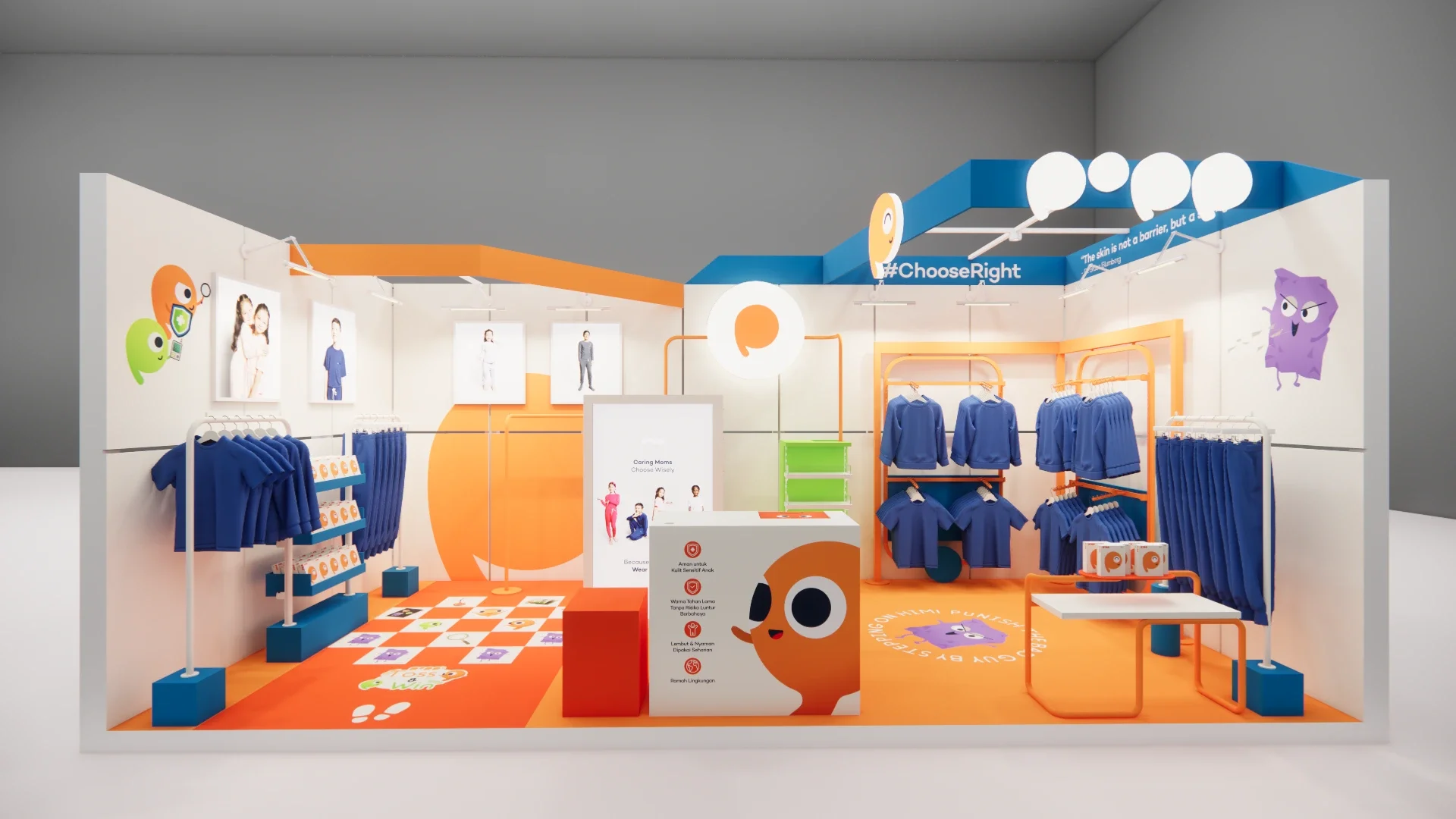
This POPP exhibition booth was designed not only to look on-brand, but to work as an experience—built specifically for a mom-and-kid audience. The layout combines 3D spatial planning with a VM system that makes the booth feel open, approachable, and easy to navigate, even during peak crowd moments.
To increase “stopping power,” we added interactive touchpoints that encourage kids to engage while giving moms the space to browse comfortably. Zoning and product hierarchy were intentionally structured so key areas remain fully visible from multiple angles, helping visitors instantly understand where to go, what to explore, and what POPP stands for.
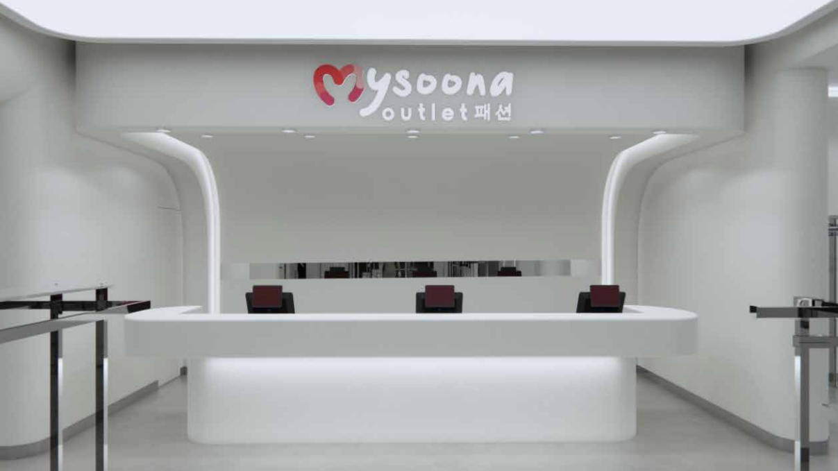
Retail Facade
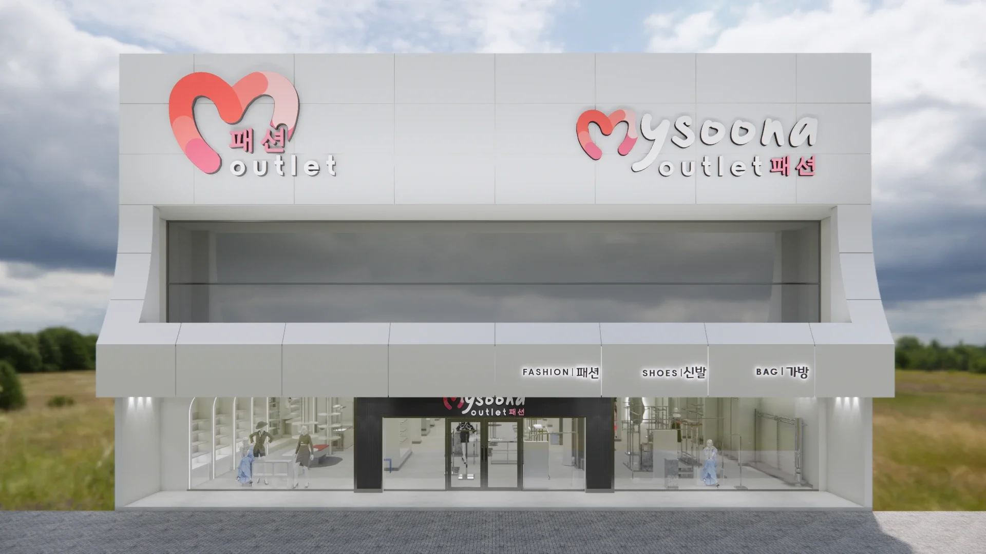
This facade concept was designed to make the brand instantly recognizable from a distance while keeping the storefront clean, premium, and highly readable. The exterior uses a strong signage hierarchy, a clear entrance focus, and balanced façade proportions to create a confident first impression and improve walk-in potential.
Beyond aesthetics, the design considers real retail needs: visibility from multiple angles, clear category cues, and an open glass frontage that reveals activity inside—helping the store feel inviting and trustworthy. The storefront is structured to support quick “scan-and-understand” moments for both pedestrians and drive-by traffic, and the result is a facade that works as both a brand statement and a conversion tool.
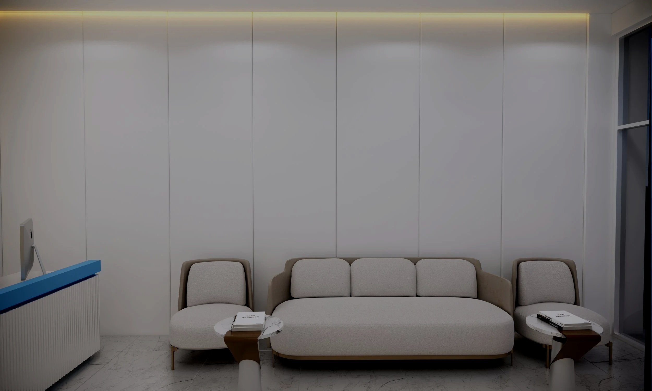
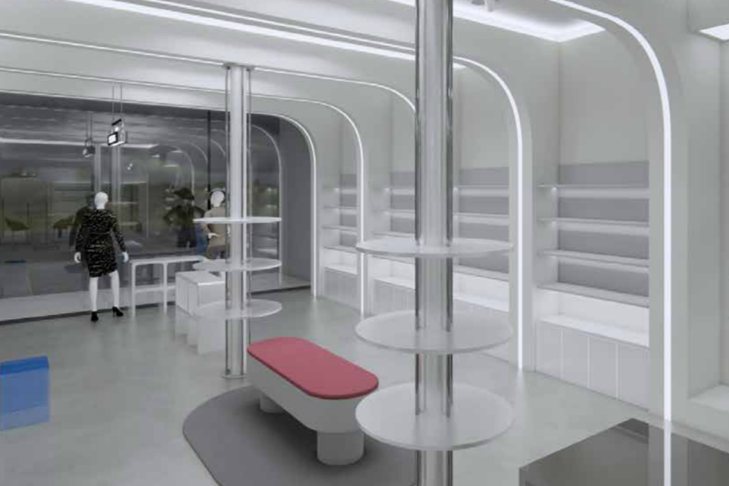
Spa & Beauty Interior
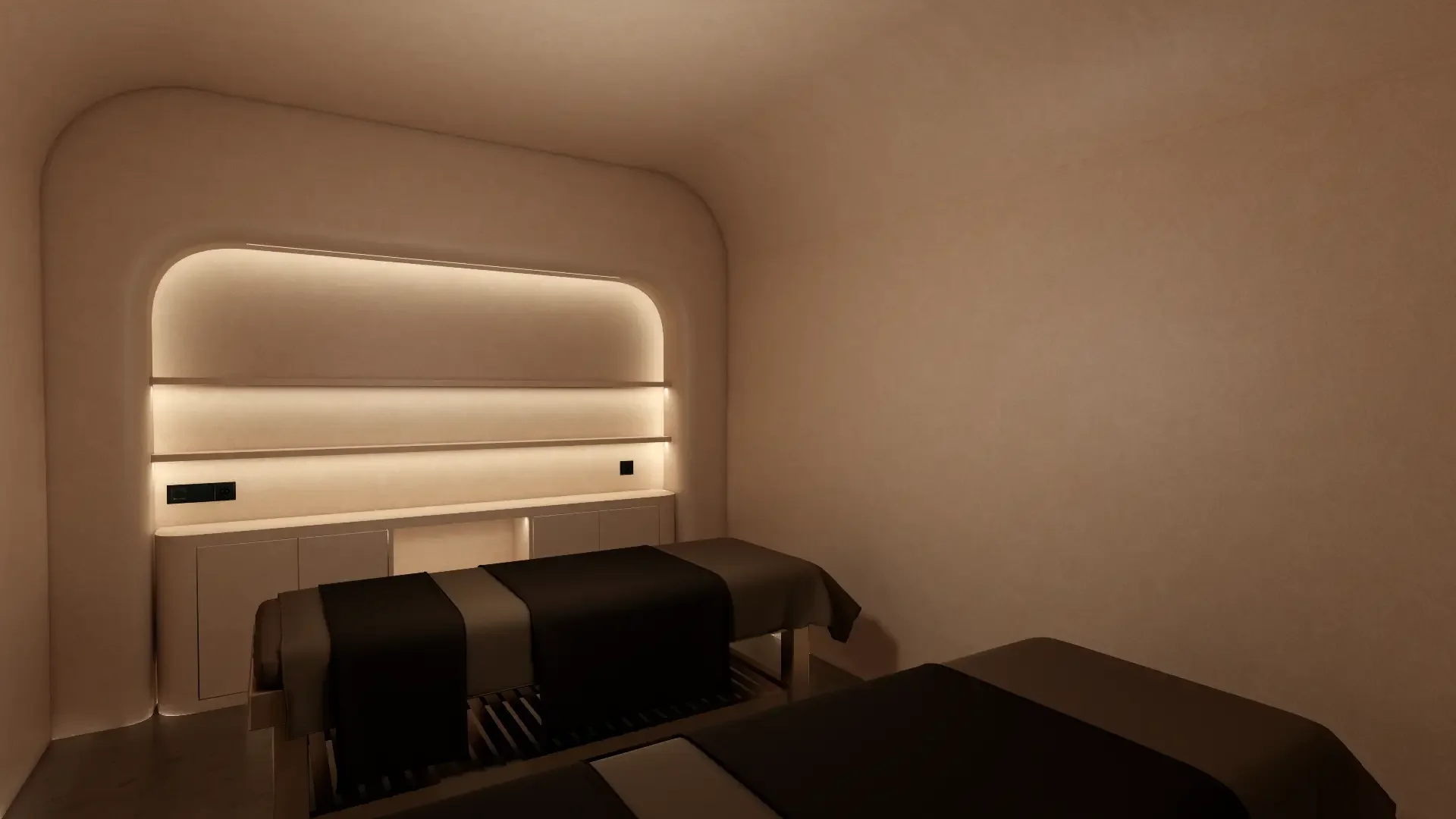
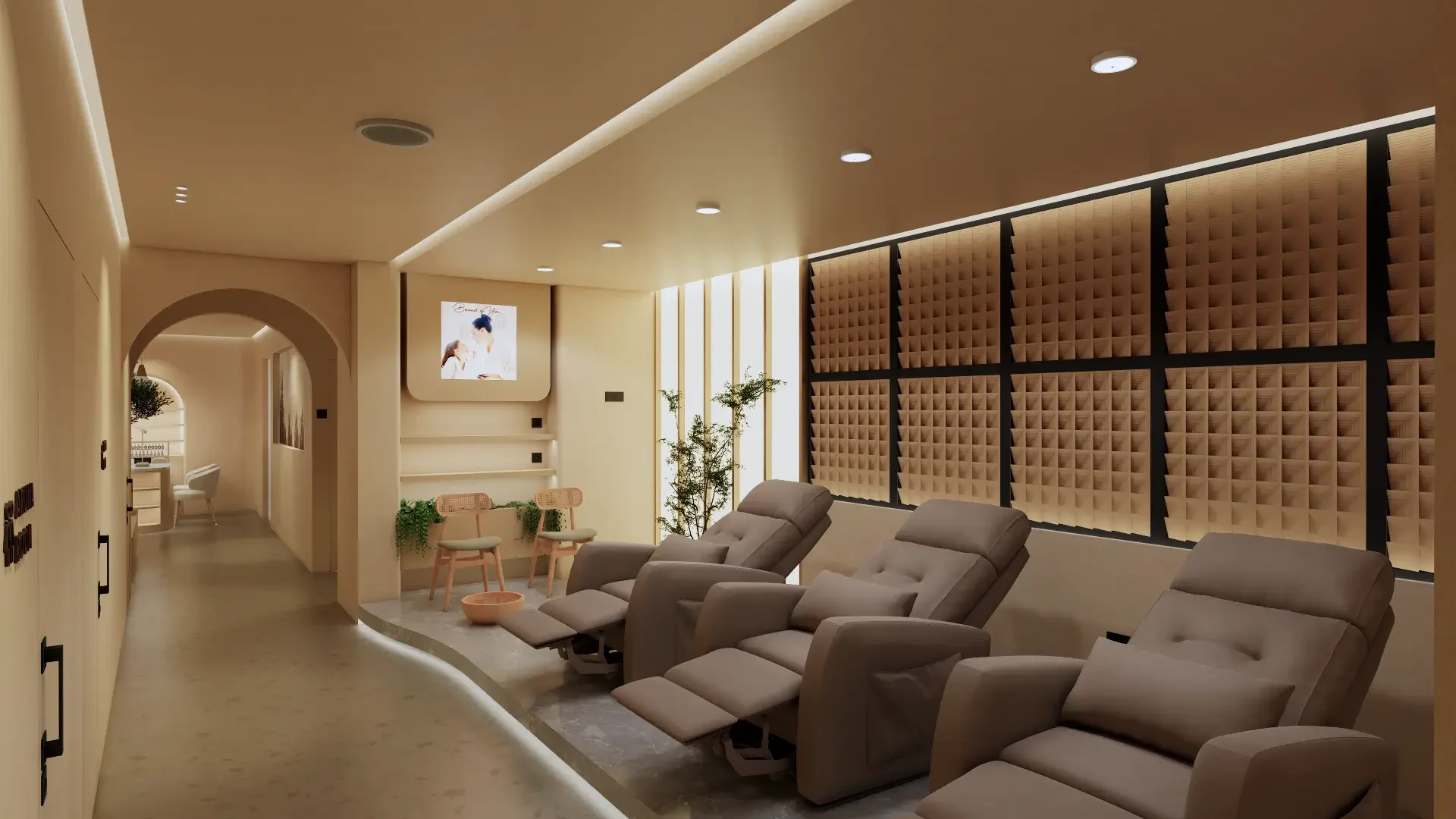
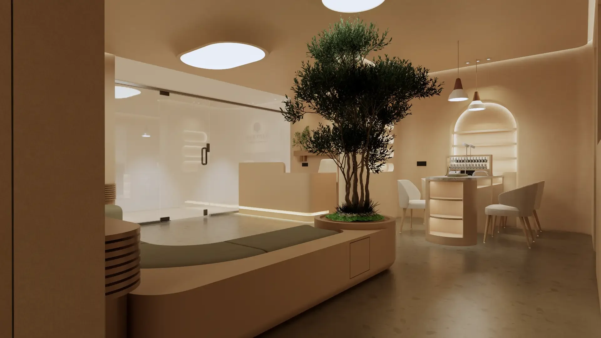
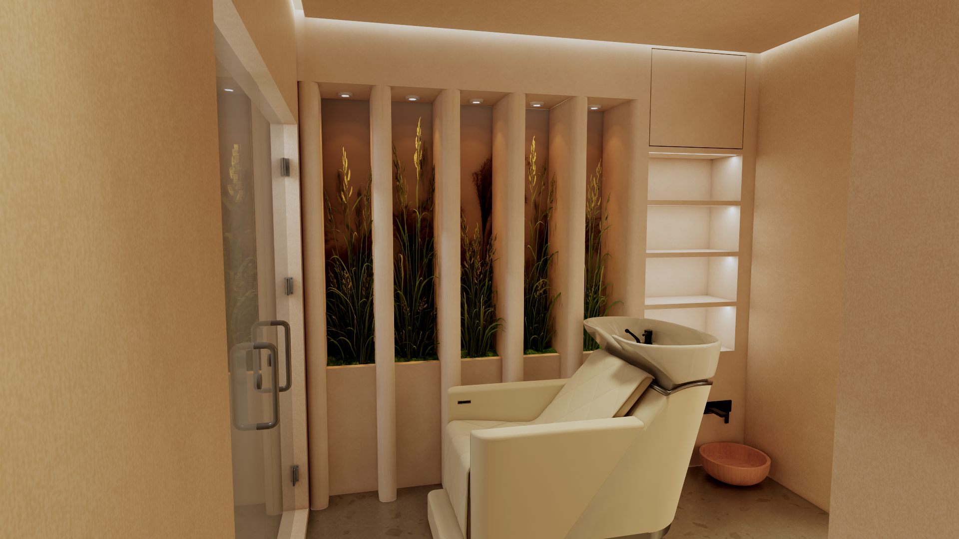
Designed for a spa and beauty setting, this 3D interior focuses on both guest comfort and daily operational flow. The layout separates high-traffic zones (reception, lounge, wash areas) from treatment rooms to protect privacy and maintain a quiet ambience—even during busy hours.
Visual and lighting decisions were planned to support a “slow-down” feeling: warm ambient lighting, concealed LED lines, and soft architectural curves create a soothing rhythm as guests move through the space. The result is an interior that improves navigation, enhances perceived quality, and strengthens brand trust through consistent sensory experience.